June 21, 2017 · 16 min read

When we work with Machine Learning for data analysis, we often encounter huge data sets that has possess hundreds or thousands of different features or variables. As a consequence, the size of the space of variables increases greatly, hindering the analysis of the data for extracting conclusions. In order to address this problem, it is convenient to reduce the number of variables in such a way that with a lower number of variables we are still able to encompass much of the information needed for data analysis.
A simple way to reduce the dimensionality of the space of variables is to apply some techniques of Matrix Factorization. The mathematical methods of Factorization of Matrices have many applications in a variety of problems related to artificial intelligence, since the reduction of dimensionality is the essence of cognition.
In this contribution we show, through some toy examples, how to use Matrix Factorization techniques to analyze multivariate data sets in order to obtain some conclusions from them that may help us to take decisions. In particular, we explain how to employ the technique of Principal Component Analysis (PCA) to reduce the dimensionality of the space of variables.
This article focuses on the basic concepts of PCA and how this technique can be applied as a useful tool for the analysis of multivariate data. However, we would like to emphasize that in this article, we do not intend to do a rigorous development of the mathematical techniques used for a PCA. It is only intended that the readers have clear the all concepts and procedures concerned with this method.
Principal Component Analysis (PCA) is a statistical procedure that uses an orthogonal transformation to convert a set of observations of possibly correlated variables into a set of values of linearly uncorrelated variables called principal components (or sometimes, principal modes of variation).
The PCA is used by almost all scientific disciplines and it probably constitutes the most popular multivariate statistical technique. PCA is applied to a data table representing observations described by several dependent variables which are, in general, inter-correlated. The goal is to extract the relevant information from the data table and to express this information as a set of new orthogonal variables. PCA also represents the pattern of similarity in the observations and the variables, by displaying them as points in maps (see Refs Jolliffe I.T.,Jackson J.E,Saporta G, Niang N. for more details).
The number of the principal components is lesser than or equal to the number of original variables or to the number of observations. This transformation is defined in such a way that the first principal component has the largest possible variance (i.e.; it accounts for as much of the variability in the data as possible), and each succeeding component in turn has the highest variance possible under the constraint that it is orthogonal to the preceding components. The resulting vectors form an uncorrelated orthogonal basis set (for more detail see ref.)
PCA is mostly used as a tool in exploratory data analysis and for making predictive models. PCA can be done by eigenvalue decomposition of a data covariance (or correlation) matrix or singular value decomposition of a data matrix, usually after mean centering (and normalizing or using Z-scores) the data matrix for each attribute (see reference Abdi. H., & Williams, L.J. ). The results of the PCA are usually discussed in terms of component scores, sometimes called factor scores (the transformed variable values corresponding to a particular data point), and loadings (the weight by which each standardized original variable should be multiplied to get the component score) (see reference Shaw P.J.A. )
In few words, we can say that the PCA is the simplest of the eigenvector-based multivariate analysis, and it is often used as a method to reveal the internal structure of the data in a way that best explains its variance. The following are some objectives of the PCA technique:
By using a toy example, we will now describe in detail and step by step how to make a PCA. After that, we will show how to use the [scikit -learn] library as a shortcut for the same procedure for data analysis.
For the following example, we will be working with the famous "Iris" dataset that has been deposited on the UCI machine learning repository (https://archive.ics.uci.edu/ml/datasets/Iris).
The iris dataset contains measurements for 150 iris flowers from three different species.
The three classes in the Iris dataset are:
And the four features of in Iris dataset are:
In order to load the Iris data directly from the UCI repository, we are going to use the superb pandas library. If you haven't used pandas yet, I want encourage you to check out the pandas tutorials. If I had to name one Python library that makes working with data a wonderfully simple task, this would definitely be pandas!
import pandas as pd
df = pd.read_csv(
    filepath_or_buffer='https://archive.ics.uci.edu/ml/machine-learning-databases/iris/iris.data',
    header=None,
    sep=',')

df.columns=['sepal_len', 'sepal_wid', 'petal_len', 'petal_wid', 'class']
df.dropna(how="all", inplace=True) # drops the empty line at file-end

df.tail()
Split data table into data X and class labels y
X = df.ix[:,0:4].values
y = df.ix[:,4].values
Our iris dataset is now stored in form of a $150 \times 4$ matrix where the columns are the different features, and every row represents a separate flower sample. Each sample row $\mathbf{x}$ can be depicted as a 4-dimensional vector
$\mathbf{x^T} = \begin{pmatrix} x_1 \newline x_2 \newline x_3\newline x_4 \end{pmatrix} = \begin{pmatrix} \text{sepal length} \newline \text{sepal width} \newline \text{petal length}\newline \text{petal width} \end{pmatrix}$
To get a feeling for how the 3 different flower classes are distributed along the 4 different features, let us visualize them via histograms.
from matplotlib import pyplot as plt
import numpy as np
import math

label_dict = {1: 'Iris-Setosa',
              2: 'Iris-Versicolor',
              3: 'Iris-Virgnica'}

feature_dict = {0: 'sepal length [cm]',
                1: 'sepal width [cm]',
                2: 'petal length [cm]',
                3: 'petal width [cm]'}

with plt.style.context('seaborn-whitegrid'):
    plt.figure(figsize=(8, 6))
    for cnt in range(4):
        plt.subplot(2, 2, cnt+1)
        for lab in ('Iris-setosa', 'Iris-versicolor', 'Iris-virginica'):
            plt.hist(X[y==lab, cnt],
                     label=lab,
                     bins=10,
                     alpha=0.3,)
        plt.xlabel(feature_dict[cnt])
    plt.legend(loc='upper right', fancybox=True, fontsize=8)

    plt.tight_layout()
    plt.savefig('PREDI.png', format='png', dpi=1200)
    plt.show()

Whether to standardize the data prior to a PCA on the covariance matrix depends on the measurement scales of the original features. Since PCA yields a feature subspace that maximizes the variance along the axes, it makes sense to standardize the data, especially, if it was measured on different scales. Although, all features in the Iris dataset were measured in centimeters, let us continue with the transformation of the data onto unit scale (mean=0 and variance=1), which is a requirement for the optimal performance of many machine learning algorithms. For standardize the data we can employ the library scikit learn.
from sklearn.preprocessing import StandardScaler
X_std = StandardScaler().fit_transform(X)
The eigenvectors and eigenvalues of a covariance (or correlation) matrix represent the "core" of a PCA: The eigenvectors (principal components) determine the directions of the new feature space, and the eigenvalues determine their magnitude. In other words, the eigenvalues explain the variance of the data along the new feature axes.
The classic approach to PCA is to perform the eigendecomposition on the covariance matrix $\Sigma$, which is a $d \times d$ matrix where each element represents the covariance between two features. The covariance between two features is calculated as follows:
$ \sigma_{ijk} = \frac{1}{n-1} \sum_{i=1}^{N} (x_{ij} - \bar{x}) (x_{ik} - \bar{x}_k) $
We can summarize the calculation of the covariance matrix via the following matrix equation:
$\Sigma = \frac{1}{n-1} \left( (\mathbf{X} - \mathbf{\bar{x}})^T\;(\mathbf{X} - \mathbf{\bar{x}}) \right)$
where $\mathbf{\bar{x}}$ is the mean vector $\mathbf{\bar{x}} = \frac{1}{n}\sum\limits_{k=1}^n x_{i}.$
The mean vector is a $d$-dimensional vector where each value in this vector represents the sample mean of a feature column in the dataset.
With numpy:
import numpy as np
mean_vec = np.mean(X_std, axis=0)
cov_mat = (X_std - mean_vec).T.dot((X_std - mean_vec)) / (X_std.shape[0]-1)
print('Covariance matrix \n%s' %cov_mat)

Covariance matrix
[[ 1.00671141 -0.11010327  0.87760486  0.82344326]
 [-0.11010327  1.00671141 -0.42333835 -0.358937  ]
 [ 0.87760486 -0.42333835  1.00671141  0.96921855]
 [ 0.82344326 -0.358937    0.96921855  1.00671141]]
The more verbose way above was simply used for demonstration purposes, equivalently, we could have used the numpy cov function:
print('NumPy covariance matrix: \n%s' %np.cov(X_std.T))
Next, we perform an eigendecomposition on the covariance matrix:
cov_mat = np.cov(X_std.T)
eig_vals, eig_vecs = np.linalg.eig(cov_mat)

print('Eigenvectors \n%s' %eig_vecs)
print('\nEigenvalues \n%s' %eig_vals)

Eigenvectors
[[ 0.52237162 -0.37231836 -0.72101681  0.26199559]
 [-0.26335492 -0.92555649  0.24203288 -0.12413481]
 [ 0.58125401 -0.02109478  0.14089226 -0.80115427]
 [ 0.56561105 -0.06541577  0.6338014   0.52354627]]

Eigenvalues
[ 2.93035378  0.92740362  0.14834223  0.02074601]
Especially, in the field of "Finance", the correlation matrix typically used instead of the covariance matrix. However, the eigendecomposition of the covariance matrix (if the input data was standardized) yields the same results as a eigendecomposition on the correlation matrix, since the correlation matrix can be understood as the normalized covariance matrix.
Eigendecomposition of the standardized data based on the correlation matrix:
cor_mat1 = np.corrcoef(X_std.T)
eig_vals, eig_vecs = np.linalg.eig(cor_mat1)
print('Eigenvectors \n%s' %eig_vecs)
print('\nEigenvalues \n%s' %eig_vals)
Eigenvectors
[[ 0.52237162 -0.37231836 -0.72101681 0.26199559]
[-0.26335492 -0.92555649 0.24203288 -0.12413481]
[ 0.58125401 -0.02109478 0.14089226 -0.80115427]
[ 0.56561105 -0.06541577 0.6338014 0.52354627]]
Eigenvalues
[ 2.91081808 0.92122093 0.14735328 0.02060771]
Eigendecomposition of the raw data based on the correlation matrix:
cor_mat2 = np.corrcoef(X.T)
eig_vals, eig_vecs = np.linalg.eig(cor_mat2)

print('Eigenvectors \n%s' %eig_vecs)
print('\nEigenvalues \n%s' %eig_vals)

Eigenvectors
[[ 0.52237162 -0.37231836 -0.72101681  0.26199559]
 [-0.26335492 -0.92555649  0.24203288 -0.12413481]
 [ 0.58125401 -0.02109478  0.14089226 -0.80115427]
 [ 0.56561105 -0.06541577  0.6338014   0.52354627]]

Eigenvalues
[ 2.91081808  0.92122093  0.14735328  0.02060771]
We can clearly see that all three approaches yield the same eigenvectors and eigenvalue pairs:
The typical goal of a PCA is to reduce the dimensionality of the original feature space by projecting it onto a smaller subspace, where the eigenvectors will form the axes. However, the eigenvectors only define the directions of the new axis, since they have all the same unit length 1, which can confirmed by the following two lines of code:
for ev in eig_vecs:
    np.testing.assert_array_almost_equal(1.0, np.linalg.norm(ev))
print('Everything ok!')
Everything ok!
In order to decide which eigenvector(s) can dropped without losing too much information for the construction of lower-dimensional subspace, we need to inspect the corresponding eigenvalues: The eigenvectors with the lowest eigenvalues bear the least information about the distribution of the data; those are the ones can be dropped.
The common approach is to rank the eigenvalues from highest to lowest in order choose the top $k$ eigenvectors.
# Make a list of (eigenvalue, eigenvector) tuples
eig_pairs = [(np.abs(eig_vals[i]), eig_vecs[:,i]) for i in range(len(eig_vals))]

# Sort the (eigenvalue, eigenvector) tuples from high to low
eig_pairs.sort(key=lambda x: x[0], reverse=True)

# Visually confirm that the list is correctly sorted by decreasing eigenvalues
print('Eigenvalues in descending order:')
for i in eig_pairs:
    print(i[0])
Eigenvalues in descending order:
After sorting the eigenpairs, the next question is "how many principal components are we going to choose for our new feature subspace?" A useful measure is the so-called "explained variance," which can be calculated from the eigenvalues. The explained variance tells us how much information (variance) can be attributed to each of the principal components.
tot = sum(eig_vals)
var_exp = [(i / tot)*100 for i in sorted(eig_vals, reverse=True)]
cum_var_exp = np.cumsum(var_exp)
then
with plt.style.context('seaborn-whitegrid'):
    plt.figure(figsize=(6, 4))

    plt.bar(range(4), var_exp, alpha=0.5, align='center',
            label='individual explained variance')
    plt.step(range(4), cum_var_exp, where='mid',
             label='cumulative explained variance')
    plt.ylabel('Explained variance ratio')
    plt.xlabel('Principal components')
    plt.legend(loc='best')
    plt.tight_layout()
plt.savefig('PREDI2.png', format='png', dpi=1200)
plt.show()
The plot above clearly shows that most of the variance (72.77% of the variance to be precise) can be explained by the first principal component alone. The second principal component still bears some information (23.03%) while the third and fourth principal components can safely be dropped without losing too much information. Together, the first two principal components contain 95.8% of the information.
It's about time to get to the really interesting part: the construction of the projection matrix that will be used to transform the Iris data onto the new feature subspace. Although, the name "projection matrix" has a nice ring to it, it is basically just a matrix of our concatenated top k eigenvectors.
Here, we are reducing the 4-dimensional feature space to a 2-dimensional feature subspace, by choosing the "top 2" eigenvectors with the highest eigenvalues to construct our $d \times k$-dimensional eigenvector matrix $\mathbf{W}$.
matrix_w = np.hstack((eig_pairs[0][1].reshape(4,1),
                      eig_pairs[1][1].reshape(4,1)))
print('Matrix W:\n', matrix_w)
Matrix W:
   [[ 0.52237162 -0.37231836]
   [-0.26335492 -0.92555649]
   [ 0.58125401 -0.02109478]
   [ 0.56561105 -0.06541577]]
In this last step we will use the $4 \times 2$-dimensional projection matrix $\mathbf{W}$ to transform our samples onto the new subspace via the equation
$\mathbf{Y} = \mathbf{X} \times \mathbf{W}$, where $\mathbf{Y}$ is a $150\times 2$ matrix of our transformed samples.
Y = X_std.dot(matrix_w)

with plt.style.context('seaborn-whitegrid'):
    plt.figure(figsize=(6, 4))
    for lab, col in zip(('Iris-setosa', 'Iris-versicolor', 'Iris-virginica'),
                        ('blue', 'red', 'green')):
        plt.scatter(Y[y==lab, 0],
                    Y[y==lab, 1],
                    label=lab,
                    c=col)
    plt.xlabel('Principal Component 1')
    plt.ylabel('Principal Component 2')
    plt.legend(loc='lower center')
    plt.tight_layout()
    plt.show()
then, We obtain the following plot
In this plot we have identify each species with different color for an easy observation. Here, we can see how the method has separated the different kind of flowers, and how using PCA allow as to identify the data structure.
For educational purposes and in order to show step by step all procedure , we went a long way to apply the PCA to the Iris dataset. However and luckily there is an already implementation in which with few code lines, we can implement the same procedure using the scikit-learn that is a simple and efficient tools for data mining and data analysis.
from sklearn.decomposition import PCA as sklearnPCA
sklearn_pca = sklearnPCA(n_components=2)
Y_sklearn = sklearn_pca.fit_transform(X_std)

with plt.style.context('seaborn-whitegrid'):
    plt.figure(figsize=(8, 6))
    for lab, col in zip(('Iris-setosa', 'Iris-versicolor', 'Iris-virginica'),
                        ('blue', 'red', 'green')):
        plt.scatter(Y_sklearn[y==lab, 0],
                    Y_sklearn[y==lab, 1],
                    label=lab,
                    c=col)
    plt.xlabel('Principal Component 1')
    plt.ylabel('Principal Component 2')
    plt.legend(loc='lower center')
    plt.tight_layout()
    plt.savefig('PREDI3.png', format='png', dpi=1200)
    plt.show()
Finally, to illustrate the use of PCA, we present another example. In this case we show the results, but we do not offer details of the calculations, due that the steps for the calculus were explain in details in the previous example. The intention of this example is to fixed the concepts of the PCA method.
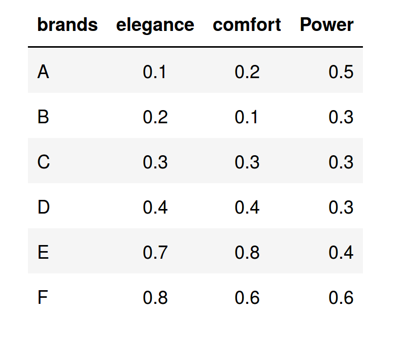
Suppose that we have the average valuation that 1,000 respondents have made on seven car brands, according to three characteristics. For simplicity, we will consider few variables (only three) in order to fix some concepts; however, in a real study, we can consider ten or twenty characteristics, since the PCA has advantages when the dimension of the data set to be analyzed is very large.
The following table shows the average values that the respondents granted to each one of the brands in the three characteristics considered:
After applying the PCA procedure to the data set, we obtain this representation in the new space (Comp1,Comp.2):

The main result is reflected in the graph of scores of the above figure, where we have represented the observations or brands in the axes formed by the first two principal components (Comp.1 and Comp.2). The cloud of individual points is centered at the origin to facilitate the data analysis. Variable points can be all located on the same side of the Comp1., as in this case, i.e., Comp.1 > 0. This occurs because the features of the considered variables are positively correlated, and when an individual (brands) takes high values in one of the characteristics, it is also high in the others.
Remember that the principal components are artificial variables that were obtained as linear combinations from the characteristics considered in the study, so that each brand (individuals) takes a value in this new space that consists of a projection of the original variables.
In order to interpret the results, we can do the following analysis:
In the first quadrant (see label I in the above figure), we note that all values of Comp.1 only take positive values. Thus, Comp.1 of quadrant I is characterized by elegance and comfort, while the Comp. 2 is characterized by its high power. Then, F brand located in this quadrant II has the three characteristics studied and, in this sense, it will be the best brand (note the direction of the arrows).
In the fourth quadrant (IV) the values of Comp.1 are greater than 0; hence, the brand placed on it (E) is characterized by elegance and comfort, but not by power, since in this quadrant all values of Comp. 2 take negative values.
In the third quadrant (III) lie both C and D, which are similar, but they are not characterized by any of these variables. Since they take very low values for all the characteristics considered, they are the worst brands.
In the second quadrant (II), the A brand is characterized by high power, but not by elegance or by comfortability. This is because the projection of A over Comp.2 > 0, while its projection on Comp1 < 0.
Finally, after the PCA analysis we can conclude that the best car brand is F, the second best car brand is E, and the third best brand is A. The other brands are the worst according to the respondents.
In this contribution we have presented a brief introduction to Matrix Factorization techniques for dimensionality reduction in multivariate data sets. In particular, we have described the basic steps and main concepts to analyze data through the use of Principal Component Analysis (PCA). We have shown the versatility of the PCA technique through two examples from different contexts, and we have described how the results of the application of this technique can be interpreted.
In APSL we consider the data analysis as a fundamental part of the business. By working on the same projects, designers, programmers, data scientists and developers get that each project are treated as a whole, and not as separate compartments. The data analyst receives the all data in the appropriate format and the systems involved in these tasks are configured to absorb the load in the record of all the information.
If do you want more information about of what we do or about of our knowledge in data processing and how we can help in your projects, do not hesitate to contact us.
Jolliffe I.T. Principal Component Analysis. New York: Springer; 2002.
Jackson J.E. A User’s Guide to Principal Components. New York: John Wiley & Sons; 1991.
Saporta G, Niang N. Principal component analysis: application to statistical process control. In: Govaert G, ed. Data Analysis. London: John Wiley & Sons; 2009, 1–23.
Abdi. H., & Williams, L.J. (2010). "Principal component analysis". Wiley Interdisciplinary Reviews: Computational Statistics. 2 (4): 433–459. doi:10.1002/wics.101.
Shaw P.J.A. (2003) Multivariate statistics for the Environmental Sciences, Hodder-Arnold. ISBN 0-340-80763-6.


